Enterprise Client · Design System
Rebuilding a Design System from Audit to Governance
Systematic Redesign of Component Library | Multi-Product SaaS | Figma + React + Storybook + Chromatic.
Role
Design System Lead
Timeline
Ongoing this case study reflects the first 3 phases
Team
1 Designer, Front-End Lead, Contributing Designers and Developers from product teams
Product
Internal Design System serving several product lines
What needed to be solved
The existing design system existed in name only. In practice:
- Components were reused without documentation or version control.
- Design tokens (colors, typography, spacing) were misaligned between Figma libraries and React/Storybook components.
- Different product teams implemented the same components differently, creating UI inconsistencies across the product suite.
- There was no governance process, no defined way to propose, review, or approve changes.
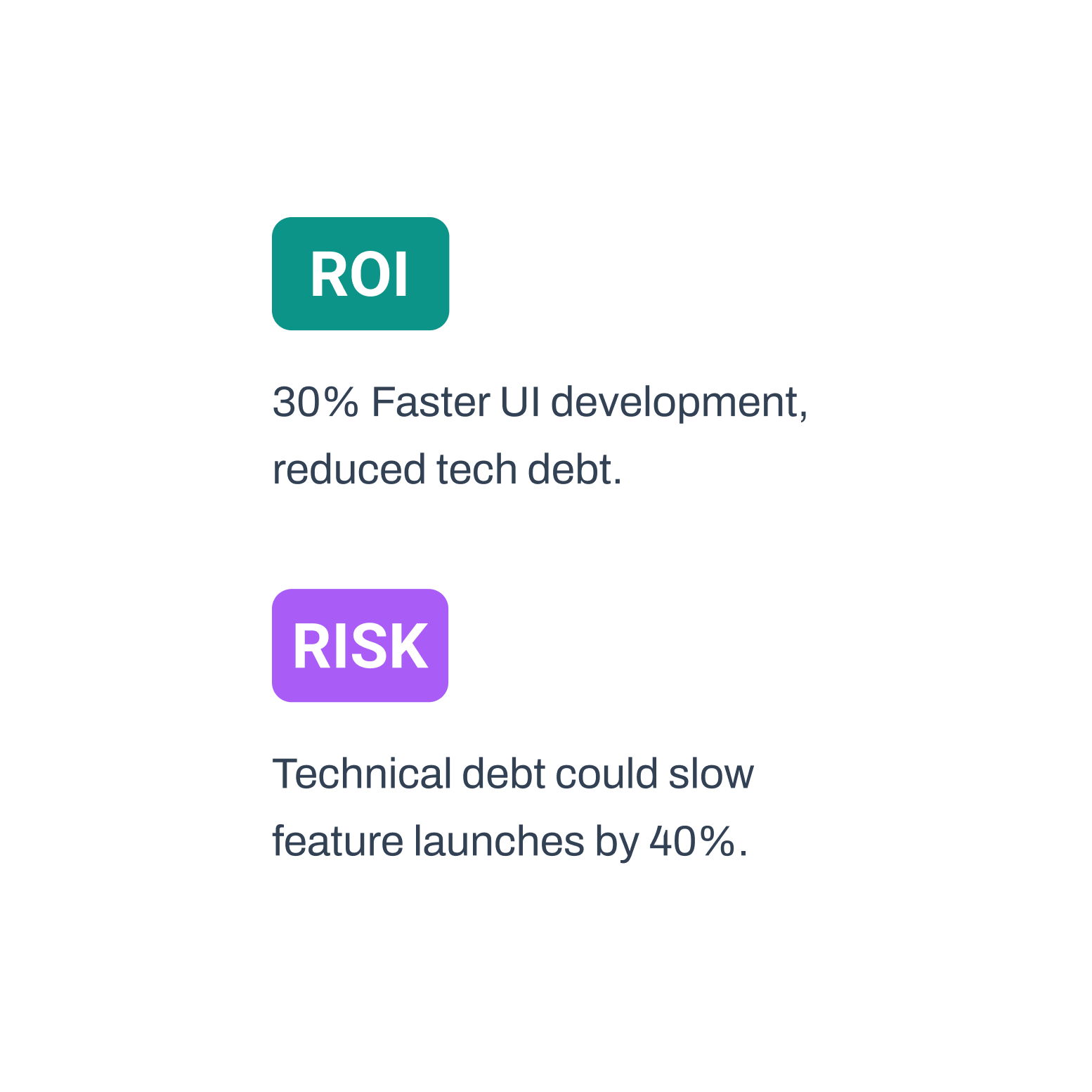
- Technical debt was estimated to be slowing down feature launches by up to 40%.
What we set out to achieve
Business Goals
- Reduce UI development time by standardizing reusable components.
- Eliminate design-code misalignment across product teams.
- Establish a governance model that scales without requiring a dedicated DS team.
Constraints
- No dedicated Design System team, the system had to be built and maintained alongside product work.
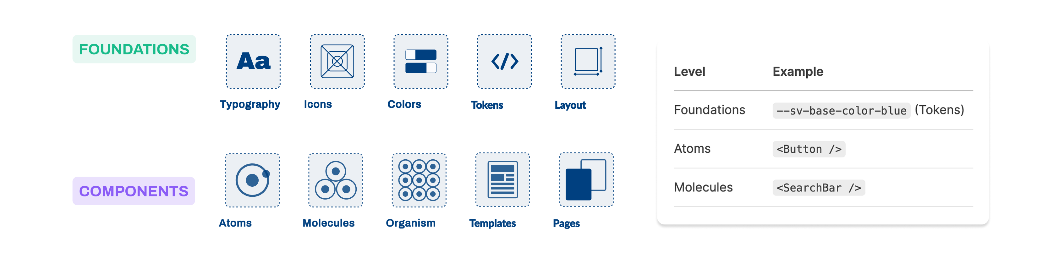
- The existing library was based on Atomic Design principles (set by a previous designer), the methodology had to be preserved for team continuity.
- React components were already in use in production, rebuilds had to be non-breaking
What we learned
System inconsistency stemmed from the absence of a structured contract between design and code, rather than a lack of components.
Implication
A unified Design Tokens architecture (color, spacing, typography) must be established as a single source of truth to enable scalable consistency and automated synchronization across design and production environments.
Low component reuse was driven by lack of trust, predictability, and documentation.
Implication
Documentation quality and usage clarity must be prioritized over component expansion, with comprehensive guidelines in both Figma and Storybook to increase adoption and reduce misuse.
Absence of visual regression testing introduced risk of undetected UI breakages.
Implication
ntegration of automated visual testing (e.g., Chromatic) into the CI/CD pipeline is required to ensure UI integrity and prevent regressions at scale.
Team structure supported a hybrid governance model (central ownership + distributed contribution).
Implication
A formal Design System governance model should be implemented, with a dedicated owner maintaining standards and a controlled contribution workflow enabling scalable evolution without fragmentation.
The choices that shaped the work
Decision
Primitive → Semantic token architecture (Figma Variables + CSS-in-JS)
Alternative considered
Hardcode values in individual components.
Why we chose it
Tokens create a single source of truth. One change propagates everywhere — theming, brand updates, and accessibility fixes become systematic, not manual.
Decision
Centralized-Decentralized governance model
Alternative considered
Centralized only (DS Lead decides everything)
Why we chose it
A centralized only model creates a bottleneck. Distributed contribution with structured review allows teams to contribute without breaking standards.
Decision
Rebuild components with MUI base + custom tokens
Alternative considered
Build all components from scratch
Why we chose it
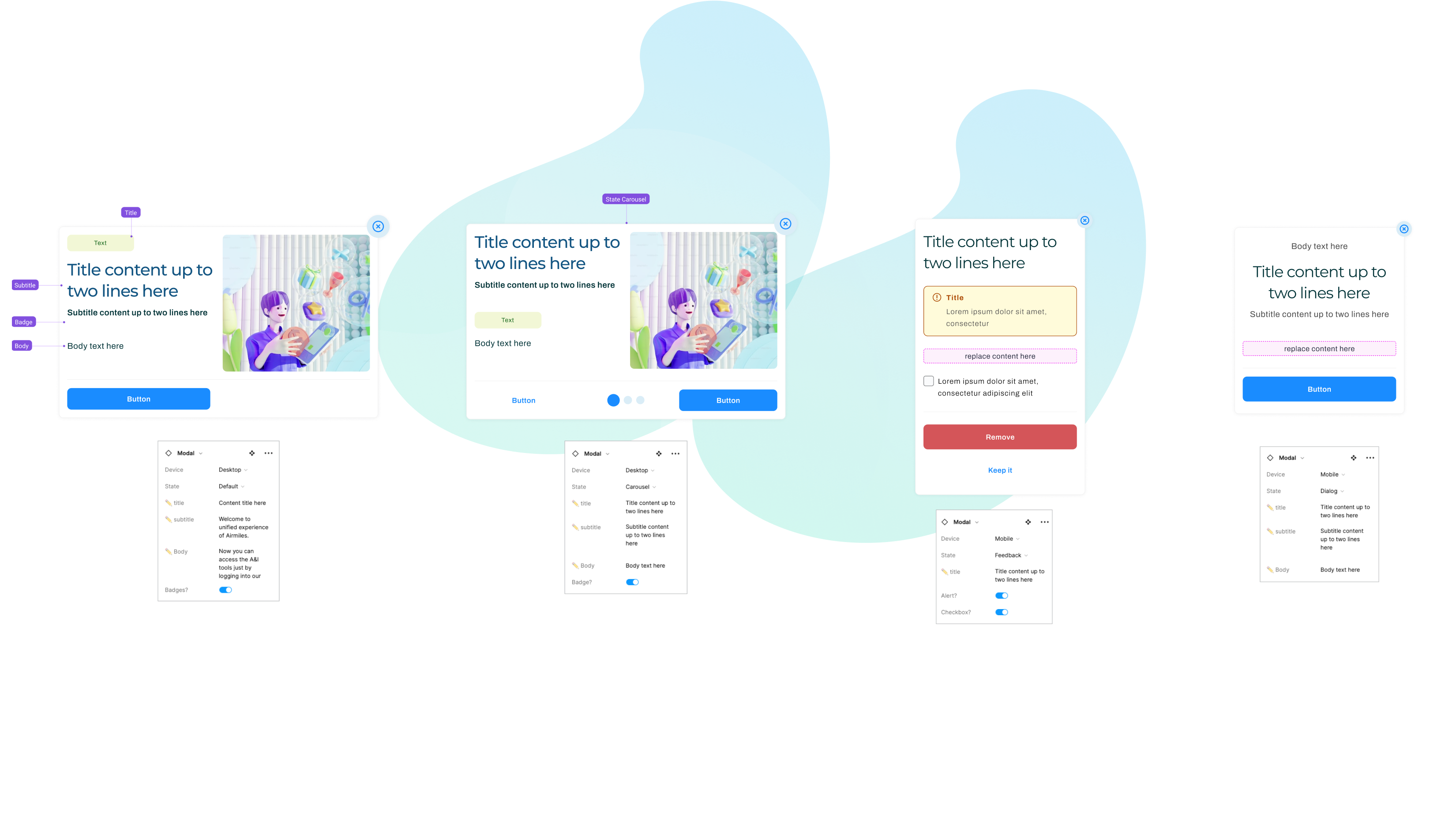
MUI provided accessibility and behavior baselines. Custom tokens applied the brand layer on top. Faster, more reliable, and accessible by default.
Decision
Chromatic for visual regression testing
Alternative considered
Manual QA review per release
Why we chose it
Manual QA does not scale. Chromatic catches visual regressions before they reach production — critical for a shared library used across multiple products.
What we built
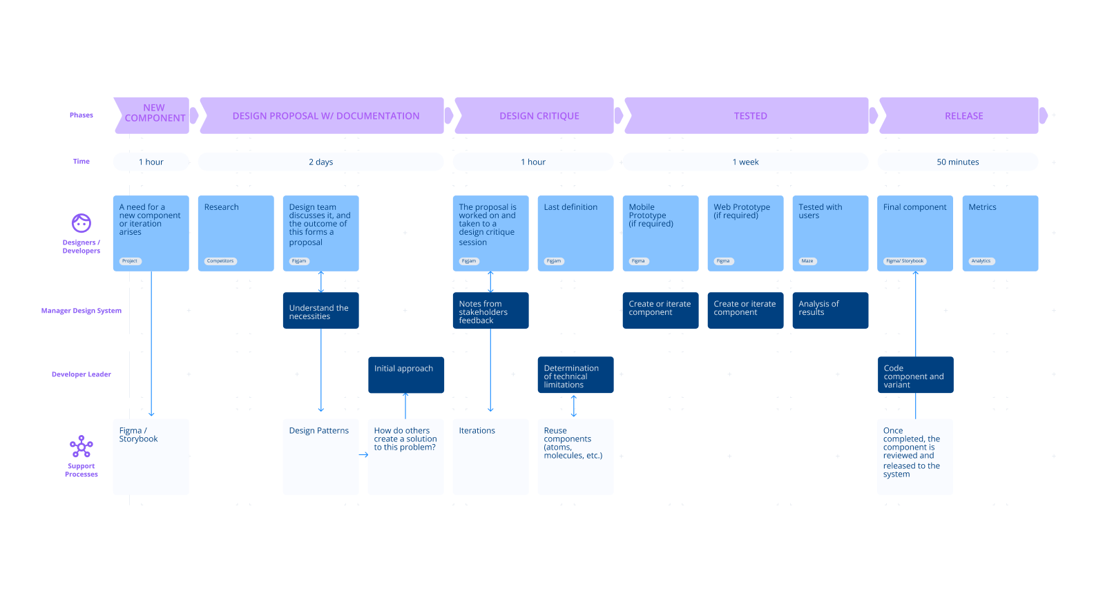
The system was rebuilt in four phases:
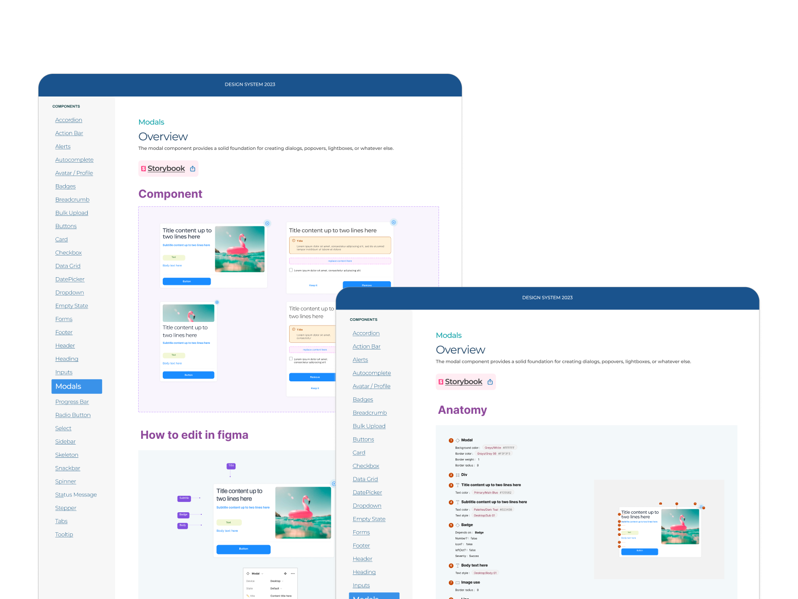
Phase 1 — Audit: Inventory of Figma libraries vs. Storybook components. Gaps in accessibility, responsiveness, and documentation were mapped.
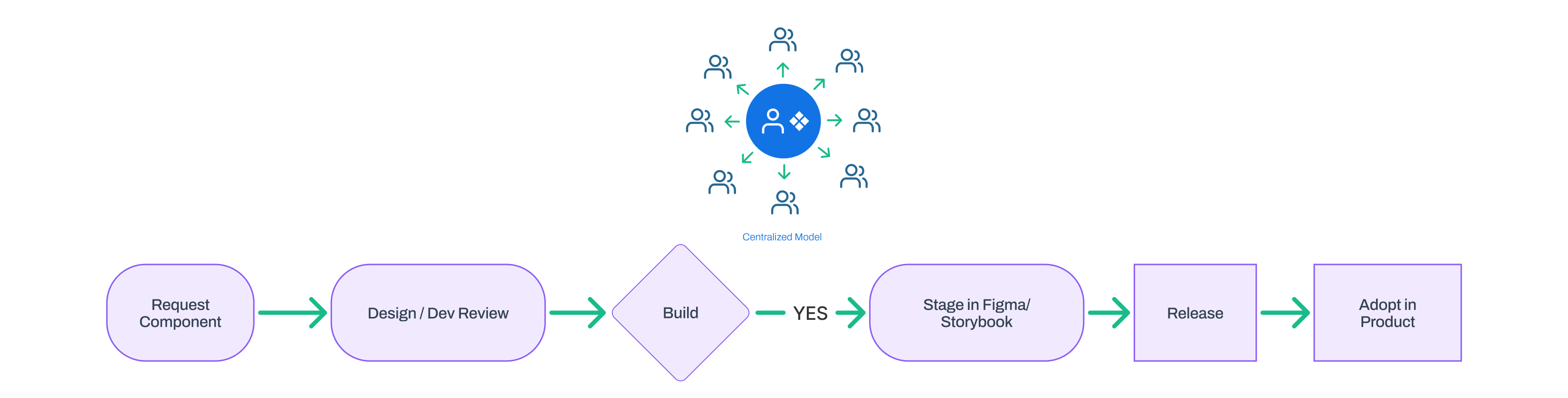
Phase 2 — Governance: Defined a contribution workflow (Request → Design/Dev Review → Build → Storybook Staging → Release → Adoption). Published as a team process document.

Phase 3 — Foundations: Synced Figma Variables (primitive and semantic tokens) with CSS-in-JS implementation. Typography, spacing, color, and layout tokens were aligned across design and code.

Phase 4 — Component Standardization: Each component was rebuilt with auto-layout + variables in Figma and MUI + custom tokens in React. Each component included props documentation, states, accessibility specs, and a Figma usage template.
What changed
Formal adoption rate metrics were not available at the time of writing. The system had been in use for a short period. Qualitative feedback from design and engineering leads was consistently positive.
- Design team mockup consistency improved significantly: components from a single source, used uniformly across products.
- Technical debt reduced: clean component code with token-driven theming eliminated duplicated style logic.
- Adoption extended beyond the initial product team. Other product squads began contributing to and consuming the library.
What we consciously left out
Token migration was incremental, not a full cutover. Some components shipped with partially migrated tokens to avoid blocking product teams.
No dedicated DS team meant governance was enforced through process, not headcount. Compliance depended on team discipline.
hromatic coverage was not 100% at launch components were added to the visual testing pipeline progressively, not all at once
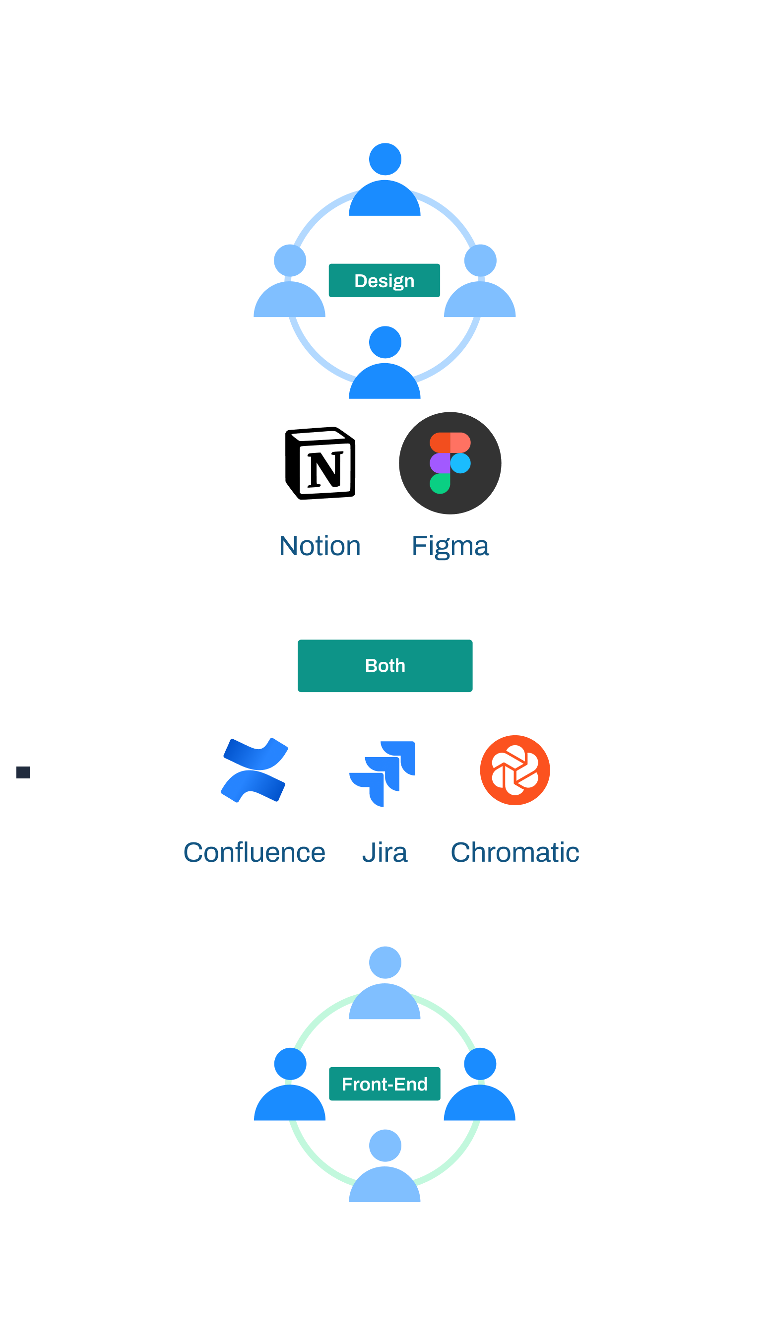
How we worked together
Worked directly with the Front-End Lead to conduct the UI inventory and define the token mapping between Figma and React.
Component proposals went through a structured Design Critique process before any build began — reducing rework.
Each component template included developer links (Storybook), usage guidelines, and Figma customization instructions — reducing back-and-forth during handoff.
Recommended to management the formation of a dedicated DS team as the next organizational step for continued scale
Key Takeaway
“A design system is only as useful as its documentation and governance. Components without clear contracts tokens, states, props, usage rules, will not be trusted or reused, regardless of their visual quality.”
Next case study
Telecom Client · E-commerce
Redesigning a Homepage as a Design System Component
© 2026 marirumo