Telecom Client · E-commerce
Redesigning a Homepage as a Design System Component
Designing a unified homepage experience that brings together users from multiple telecom, internet and entertainment brands into one platform.
Role
Product Designer
Timeline
12 months
Team
PM & BA · Designers · Research & Analytics Team · Front-End Engineers
Product
B2C Telecom Homepage — High-traffic public site managed in AEM
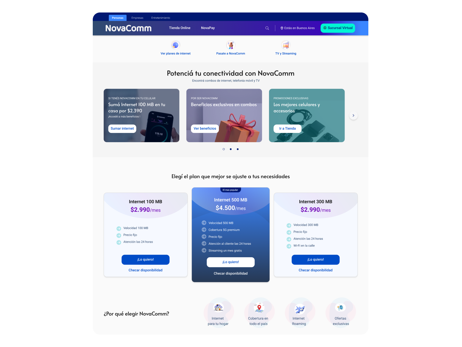
What needed to be solved
The homepage served two distinct audiences — existing customers (87% of traffic) and new visitors — with a single, undifferentiated layout. The result:
- No audience segmentation: customers and prospects saw the same content.
- Campaign overload: business requirements pushed 3+ simultaneous promotions onto one screen
- Low-performing offer cards: survey data confirmed imagery was irrelevant to users
- Critical self-service tools (bill pay, account management) were below the first scroll on mobile.
- No AEM-compatible component standard: each new request required building from scratch
What we set out to achieve
Business Goals
- Increase NPS on the homepage
- Improve click-through rate on self-service tools (bill payment, account management)
- Enable campaign flexibility without UI regressions
Constraints
- AEM imposed strict content block structures, components had to be content-agnostic and modular.
- No authentication layer was available to distinguish logged-in users from anonymous visitors
- Design-to-dev cycles needed to accelerate without increasing component count.
What we learned
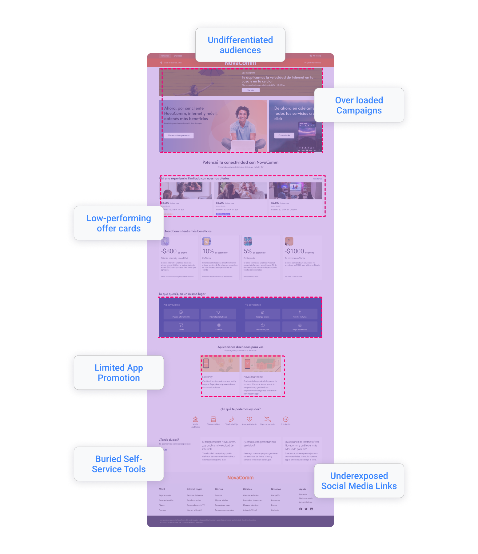
87% of homepage traffic originated from returning users with task-oriented intent rather than exploratory behavior.
Implication
The homepage must be restructured as a functional entry point prioritizing task execution, with primary actions (dashboard, payments, account controls) surfaced above the fold to minimize interaction cost and cognitive load.
Heatmap analysis identified “Bill Pay” and “Account Management” as the highest-engagement elements, both positioned below the mobile fold.
Implication
obile information architecture requires immediate re-prioritization, elevating high-frequency actions above the fold to align UI hierarchy with observed behavioral patterns and reduce friction in critical flows.
Offer card imagery showed low engagement and weak user resonance.
Implication
Non-performant visual assets should be replaced with value-oriented UI components or contextually relevant, localized content that communicates utility and improves conversion efficiency.
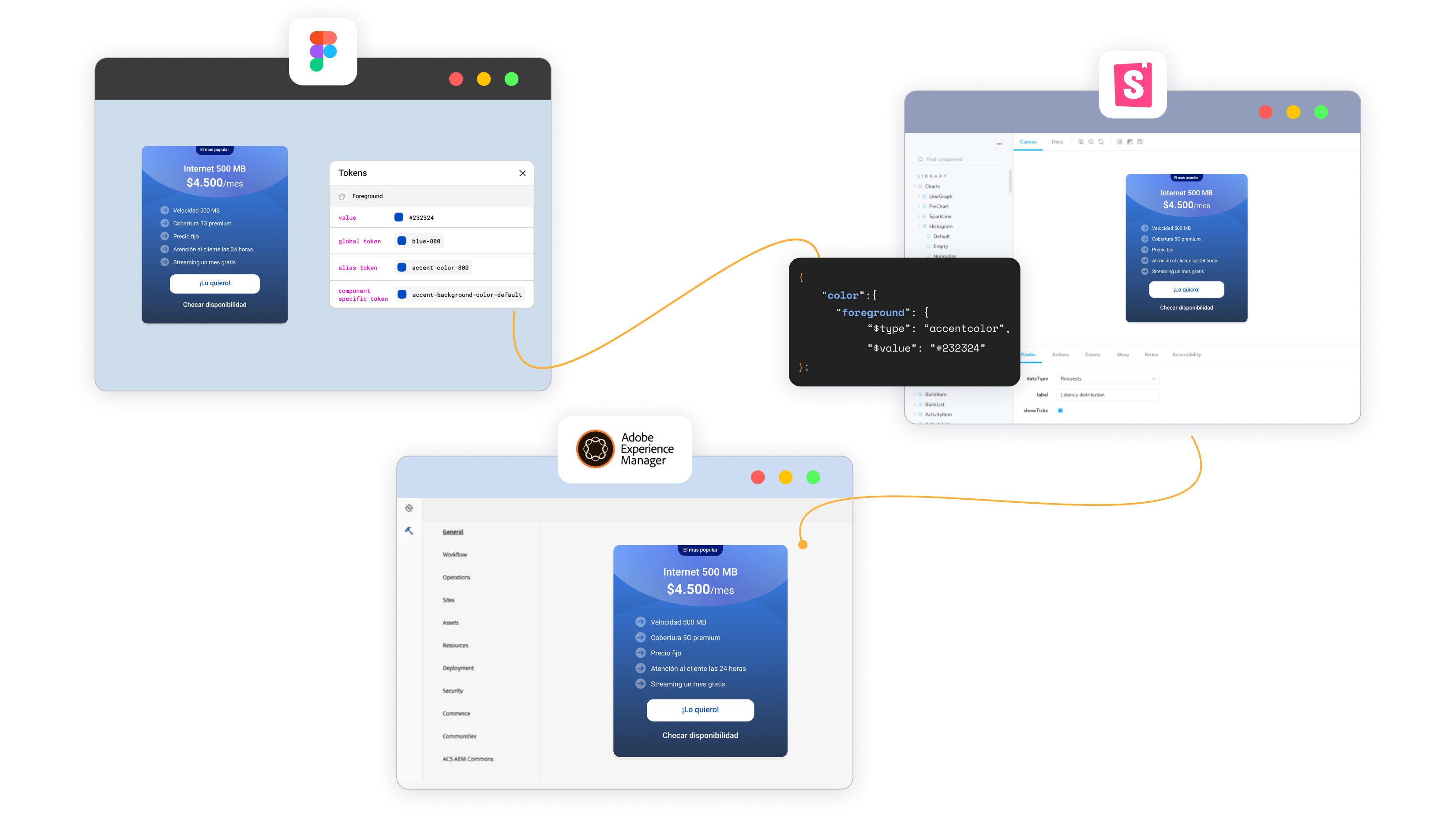
Existing frontend stack (Tailwind + Storybook) lacked alignment with design artifacts, creating handoff inefficiencies.
Implication
Design and development systems must be synchronized through shared component taxonomy and naming conventions, ensuring parity between Figma components and Storybook implementations to eliminate translation overhead.
The choices that shaped the work
Decision
Redesign for existing customers first (mobile-first layout)
Alternative considered
Redesign for both audiences simultaneously
Why we chose it
87% of traffic was existing customers. Optimizing for the majority had a higher impact and lower risk.
Decision
Modular carousel replacing static banners
Alternative considered
Keep static banners, limit to one campaign
Why we chose it
Business needed multi campaign display. A carousel solved the space problem without overriding business goals.
Decision
Single AEM card component with content variants
Alternative considered
Build separate components per use case
Why we chose it
Reduced dev effort. One component = one review cycle. Multiple variants served different contexts without new builds
Decision
Elevate quick links to top of viewport on mobile
Alternative considered
Keep account tools in navigation only
Why we chose it
Task-oriented users needed direct access. Top placement reduces time on page and supports friction
What we built
The redesigned homepage introduced six core components, all built for AEM and documented in Storybook. All components were aligned with Tailwind utility tokens and documented with states, variants, and accessibility specs in Storybook.
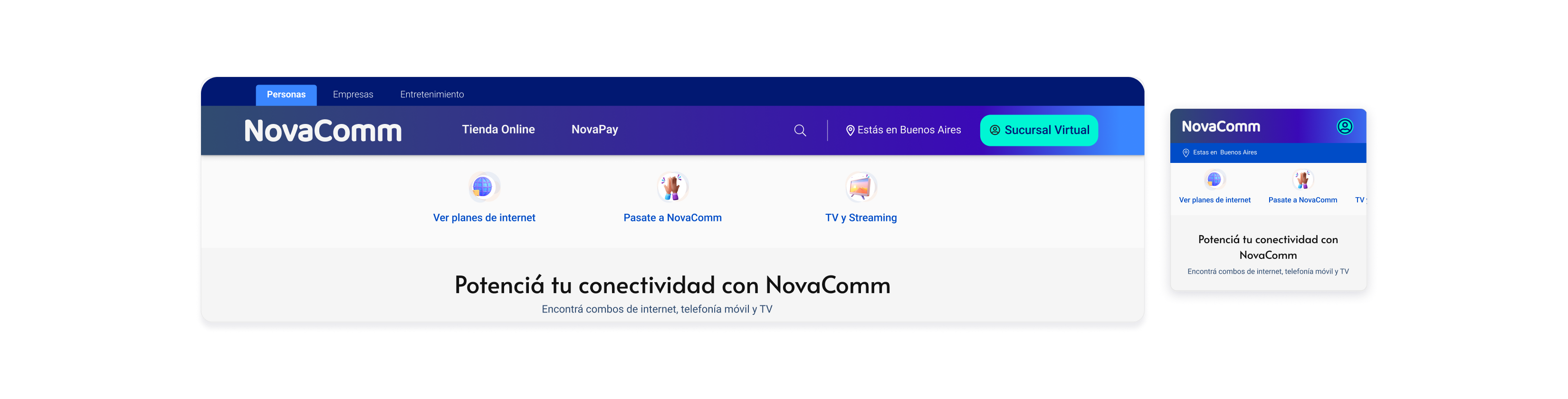
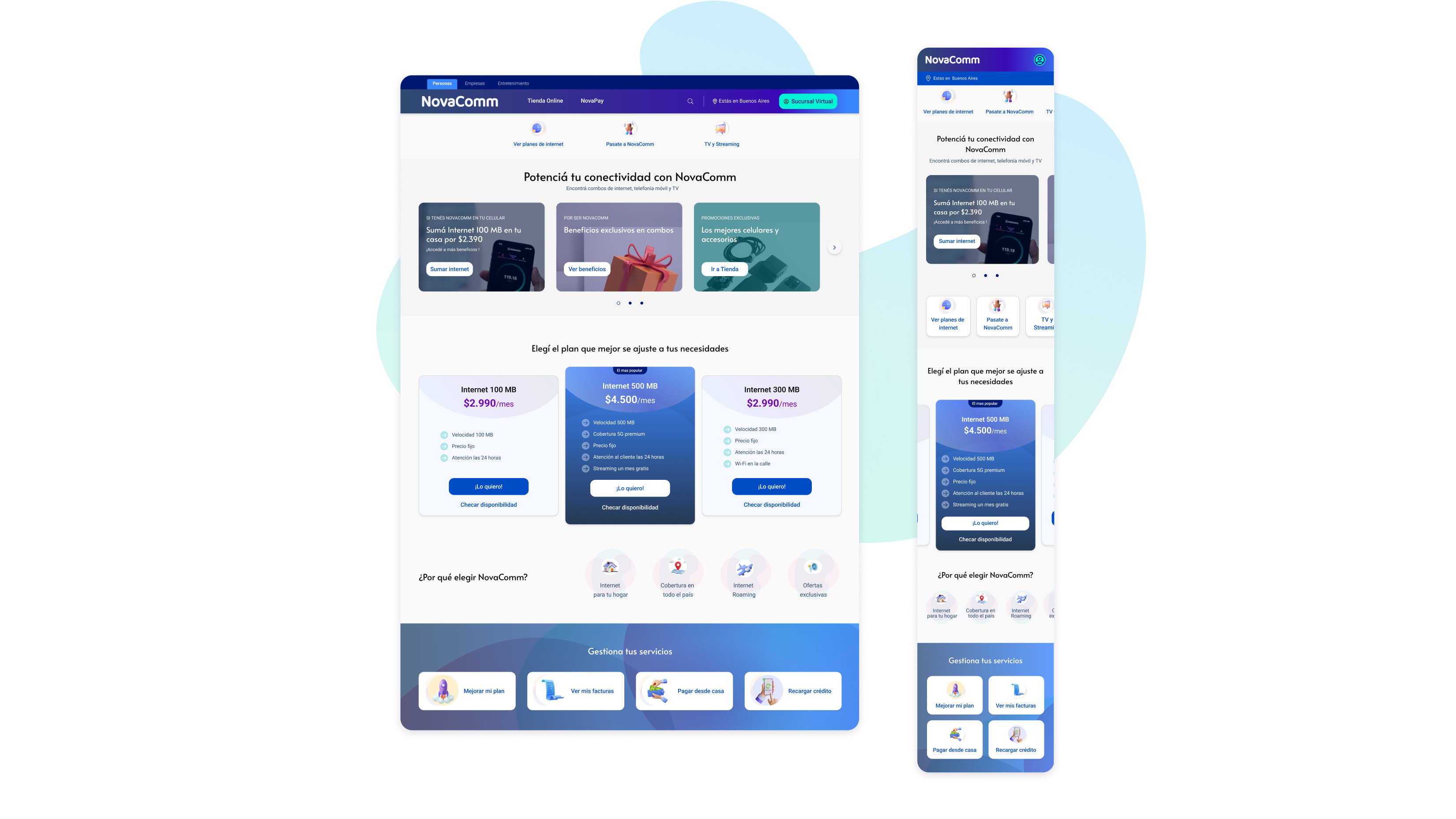
Quick Links Bar: Top-of-screen access to bill pay, account settings, and services.
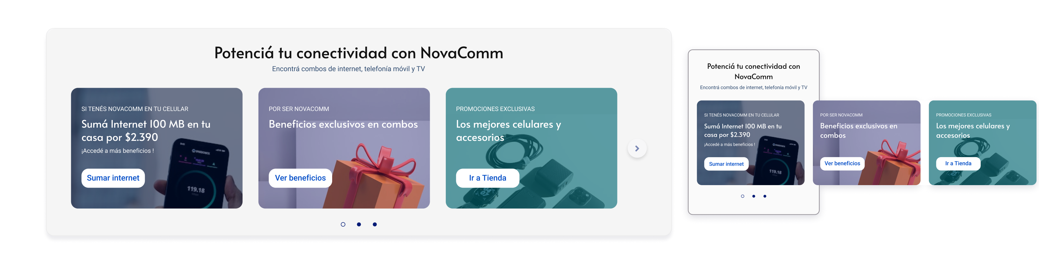
Dynamic Campaign Carousel: Multi-offer display with pagination controls, replacing static banners.
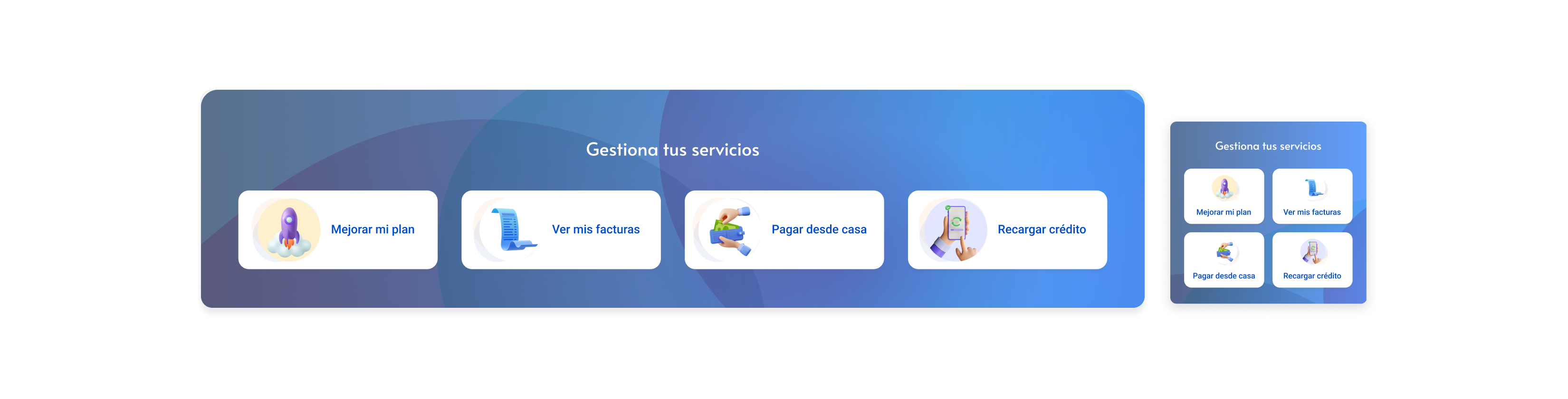
One-Click Management Module: Refocused exclusively on existing customers; repositioned above the fold.
Redesigned Offer Cards: Updated visual hierarchy and relevant imagery based on survey feedback.
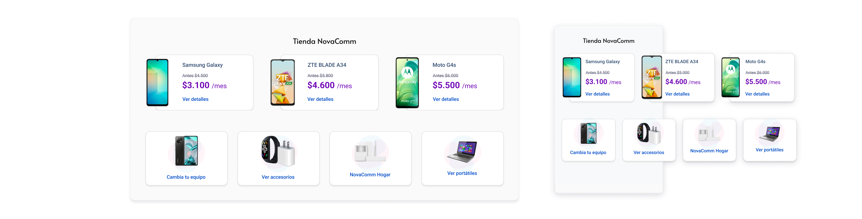
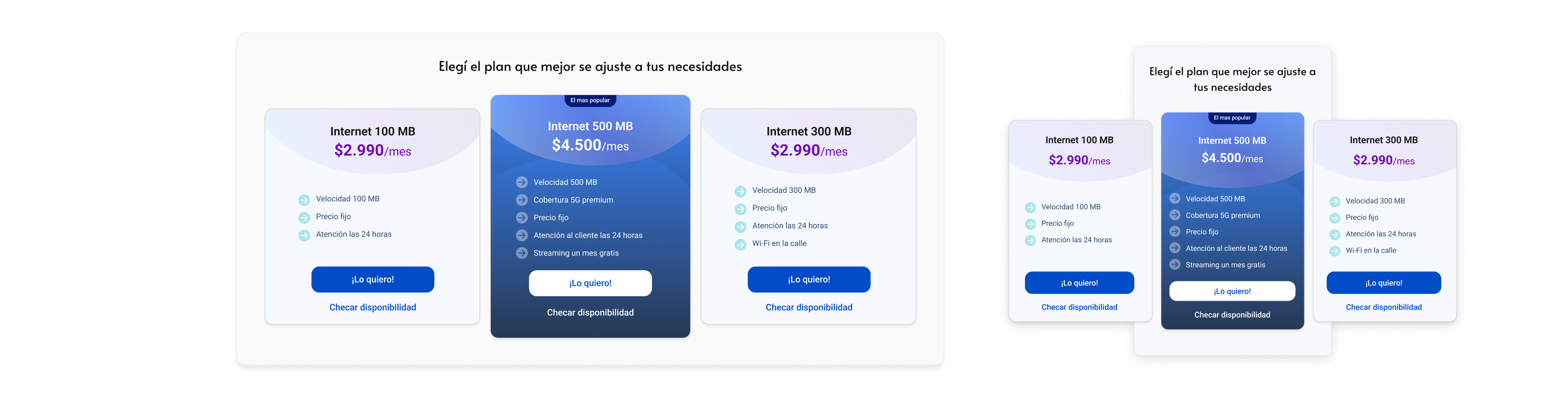
Store Access Component: Dedicated section for phones and accessories — a reusable block for future campaigns.
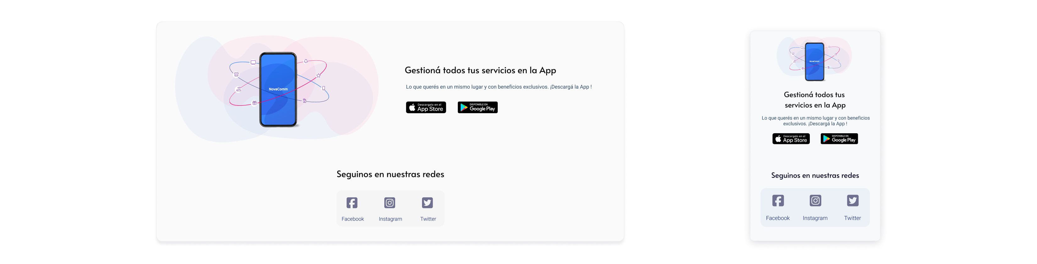
Social & App Promotion Strip: Low-disruption placement for app download and social links.
What changed
11.68%
reduction in 'My Bills FAQ' access
40%
Faster delivery
- Users found what they needed faster, without needing support content.
- Reduction in design-to-development turnaround time via the Storybook/Tailwind handoff model.
- 100% of the redesign was achieved using reused or restructured Design System assets.
- The component library expanded to additional teams beyond the homepage team after launch
What we consciously left out
No audience segmentation at launch: the lack of an authentication layer meant both user groups still shared the same layout. The design mitigated this via content prioritisation, not personalisation.
Carousel accessibility was flagged during QA. The team agreed to ship with basic controls and address ARIA patterns in the next iteration
Deep customization per campaign was deprioritized to keep AEM components content-agnostic and maintainable.
How we worked together
Content Design & Brand Alignment: Partnered closely with Content Designers to integrate UX writing seamlessly into the design system, ensuring a cohesive brand voice and tone across all touchpoints.
Engineering & System Documentation: Co-authored Storybook documentation alongside the Front-End Lead, establishing a robust component changelog to maintain strict version control and streamline handoffs.
Data-Informed Prioritization: Leveraged heatmap data and user survey insights from the Research & Analytics team to objectively prioritize the product backlog and design Decisions.
Technical Feasibility & Guardrails: Validated component architecture with Product Managers against Adobe Experience Manager (AEM) publishing constraints early in the process, mitigating technical debt before final sign-off.
Design Governance & Stakeholder Alignment: Facilitated design critique sessions with key stakeholders to de-risk layouts and components, securing alignment prior to engineering kickoff.
Business Strategy Integration: Partnered with Product Managers to translate complex business goals and market constraints into actionable, user-centric design requirements.
Key Takeaway
“Designing for a CMS means designing for constraints first. Components that are flexible, content-agnostic, and documented in Storybook ship faster and scale further than bespoke solutions.”
Next case study
Financial Client · FinTech
Designing a B2B/B2C Payment Wallet Inside an Existing Ecosystem
© 2026 marirumo