Financial Client · FinTech
Designing a B2B/B2C Payment Wallet Inside an Existing Ecosystem
End-to-End Product Design of ZipaPay | Fintech | Android, iOS, Web, Back-Office.
Role
Product Designer (End-to-End)
Timeline
Discovery → MVP — accelerated timeline due to COVID-19
Team
1 Designer, Product Team, Technical Architecture Team
Product
Payment Wallet (B2B/B2C)
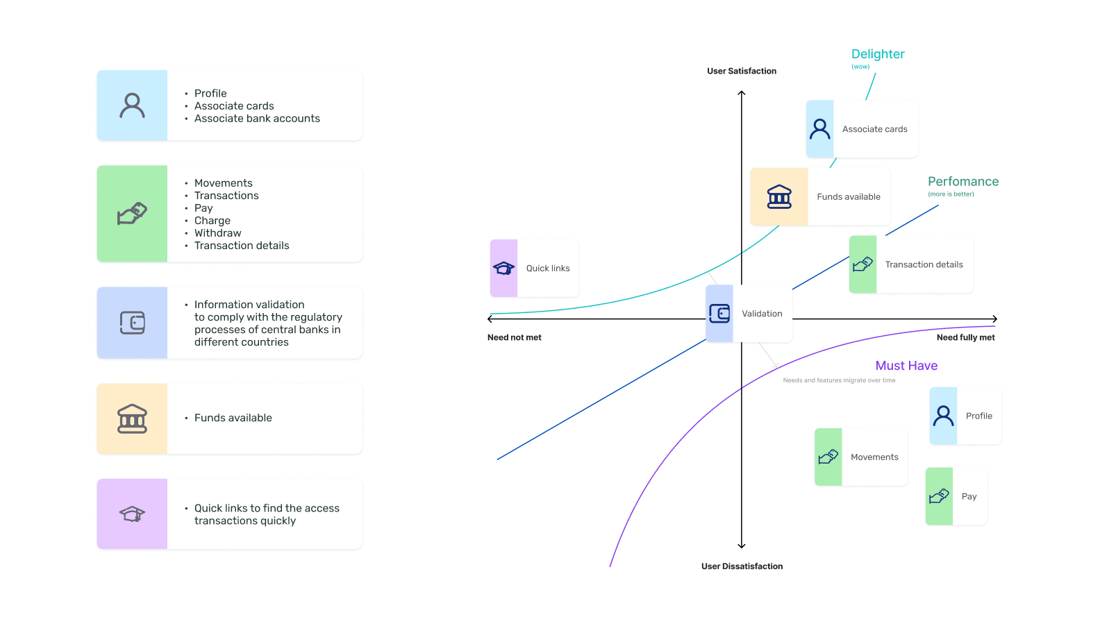
What needed to be solved
The Zipa ecosystem (B2B marketplace + B2C delivery app) relied on external payment providers. This created two critical failure points:
- Payment flow broken: Users had to leave the ZipaGo app to complete a transaction, friction at the point of highest intent.
- Reliability dependency: External providers caused outages and delays that Zipa had no ability to resolve internally.
- Support cost: Each payment disruption generated a support ticket, customer service load was directly tied to third-party uptime
What we set out to achieve
Business Goals
- Eliminate external payment dependency by building an in-house solution.
- Support QR code payments as a priority feature,contactless demand increased due to COVID-19.
- Expand to international markets, the architecture needed to accommodate country-specific banking regulations
- Increase app retention through payment-linked rewards and benefits
Constraints
- Pandemic disrupted in person user research and usability testing, the team moved to remote methods and post launch surveys.
- KYC (Know Your Customer) compliance was mandatory per local financial regulations, identity verification had to be integrated into the onboarding flow
- Design had to work across Android, iOS, Web, and Back-Office, a unified UI Kit was essential for consistency and development speed.
- MVP scope was defined collaboratively with Product to manage delivery risk.
What we learned
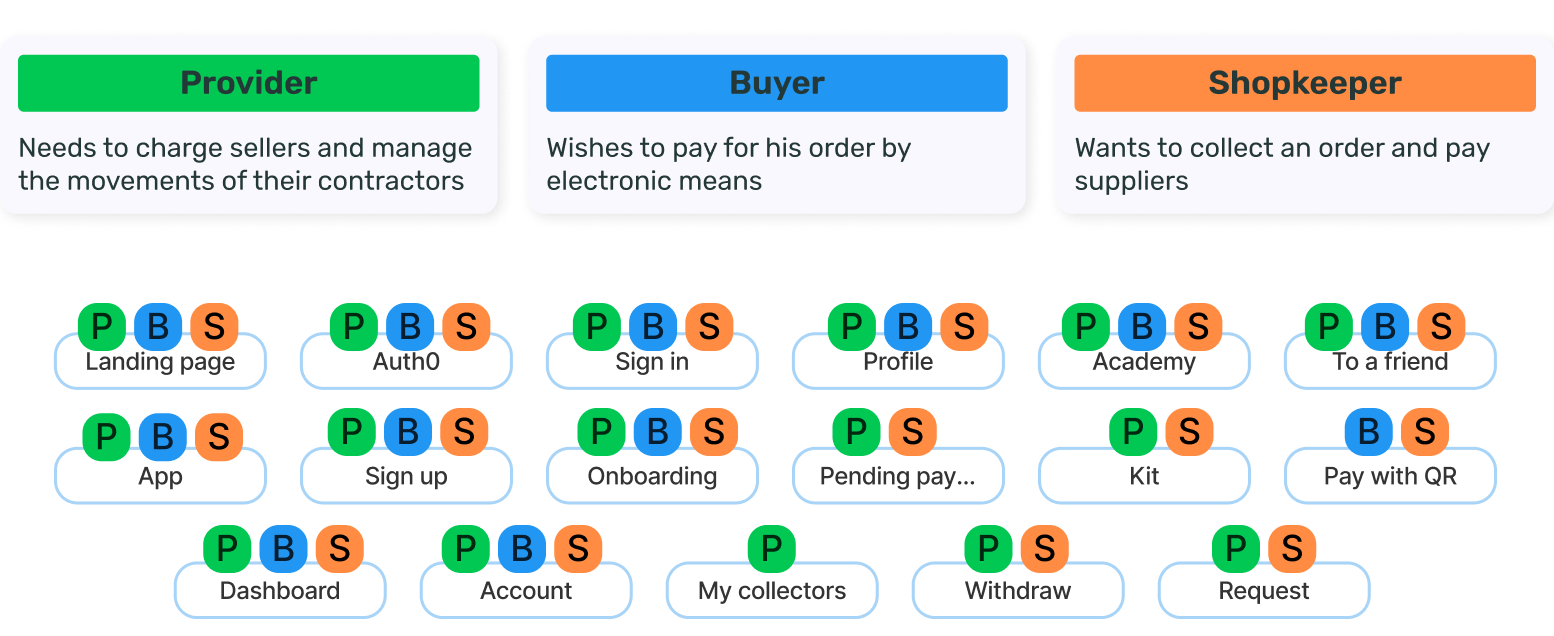
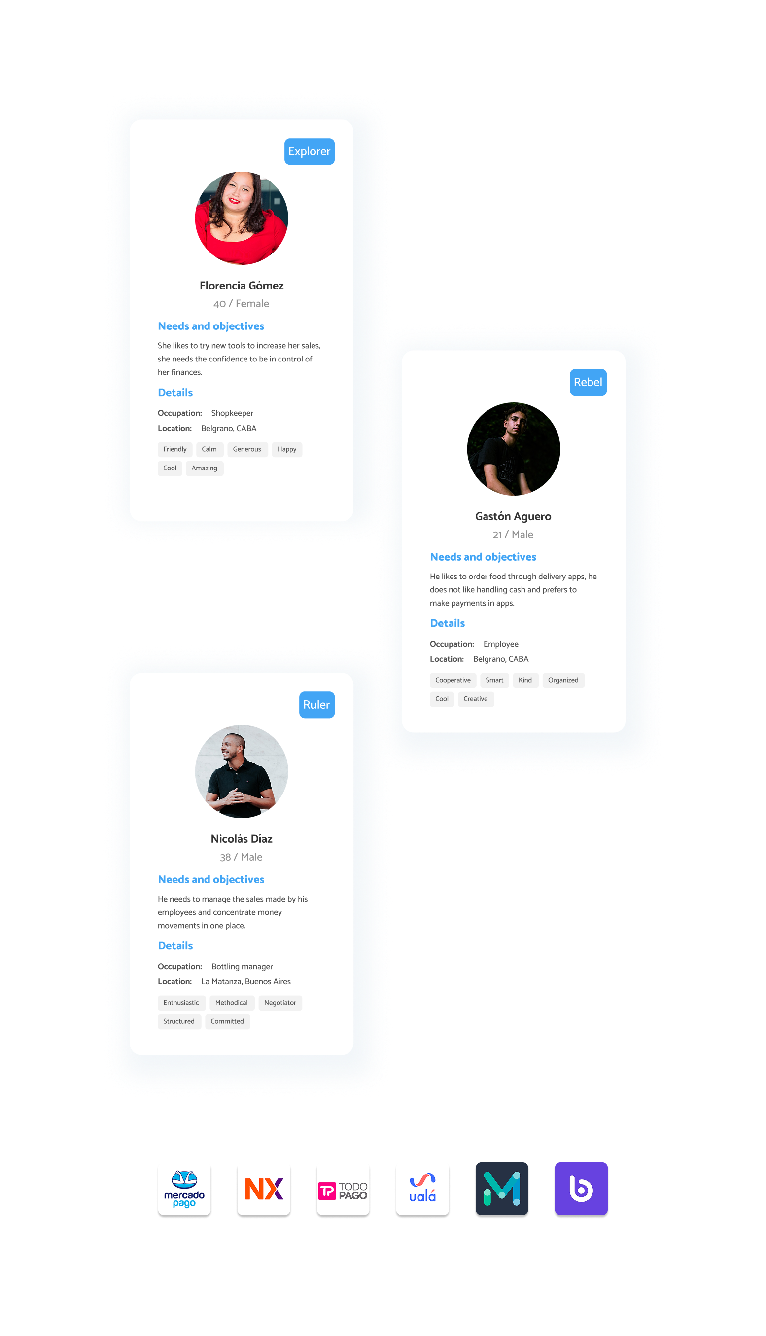
Three distinct user roles (Providers, Shopkeepers, Buyers) exhibited fundamentally different task priorities.
Implication
Interface architecture must support role-based personalization, delivering adaptive navigation and dashboards tailored to role-specific workflows and goals.
Users demonstrated moderate-to-high familiarity with fintech products, raising usability expectations.
Implication
Interaction design must meet consumergrade standards in responsiveness, feedback, and micro-interactions to remain competitive and prevent churn to alternative solutions.
Trust was identified as the primary emotional barrier in adoption.
Implication
Onboarding flows must incorporate explicit trust mechanisms (security indicators, transparent data handling, reassurance microcopy) at critical decision points to reduce perceived risk.
Competitive benchmarking highlighted four core functional expectations: card linking, QR payments, transfers, and bank integration.
Implication
These capabilities should define the MVP scope, with design efforts focused on optimizing clarity, speed, and error prevention within these high-impact flows.
The choices that shaped the work
Decision
Prioritize QR code payments in MVP scope
Alternative considered
Full feature parity before launch
Why we chose it
COVID-19 accelerated contactless payment adoption. QR was the highest impact feature with the lowest implementation complexity, the right first release.
Decision
3 screen progressive onboarding
Alternative considered
Single onboarding screen or feature tour overlay
Why we chose it
Progressive disclosure reduced cognitive load for a new financial product. Users needed to understand core actions before reaching the home screen.
Decision
Role-Based Access Control (RBAC) at the architecture level
Alternative considered
Single unified interface for all user types
Why we chose it
Each role had fundamentally different primary actions. A single view would have buried critical functions for each segment.
Decision
Push based payment request between ZipaGo and ZipaPay
Alternative considered
Manual payment entry by the buyer
Why we chose it
Manual entry introduced errors and friction. A seller, initiated request auto displayed in the buyer's ZipaPay app, reducing steps from 5 to 2.
What we built
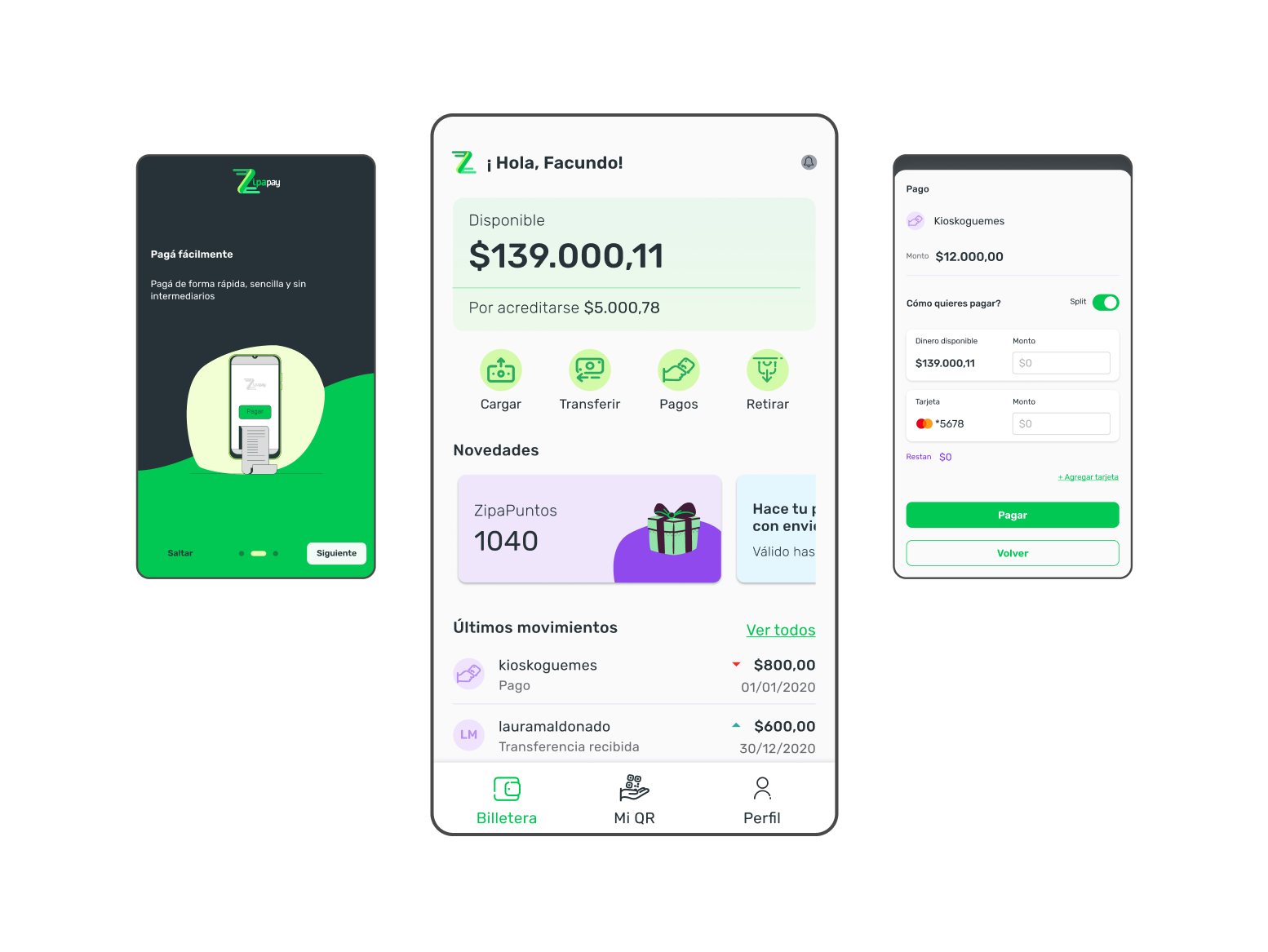
ZipaPay was designed as a modular wallet integrated across the Zipa ecosystem. A unified UI Kit (custom icons, illustrations, component library) was built for iOS, Android, and Web to ensure design consistency across all platforms:

Onboarding + KYC: 3-screen onboarding using progressive disclosure. Identity verification integrated at account creation to meet legal requirements.
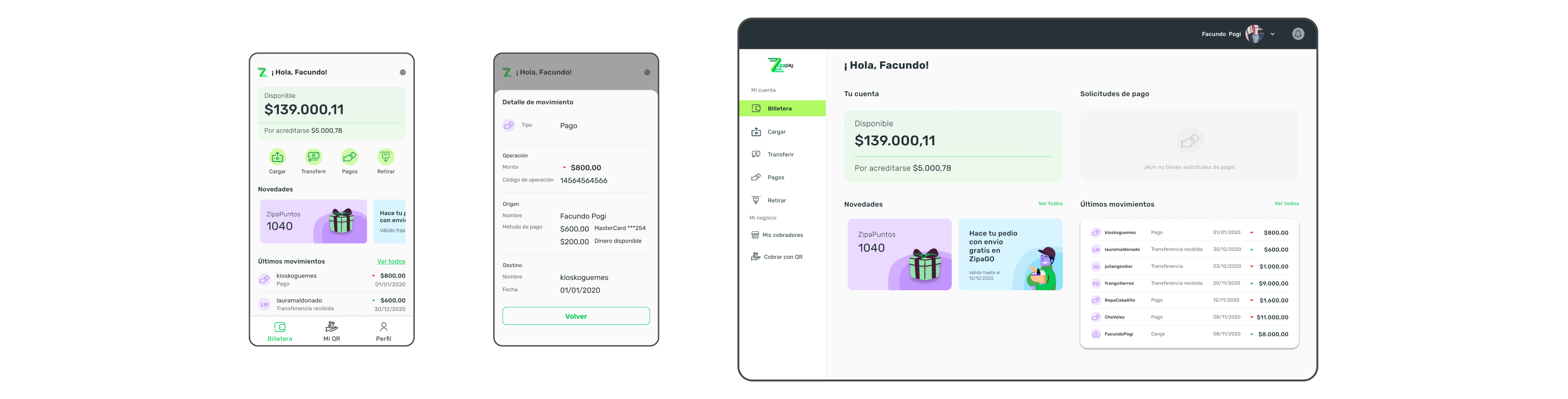
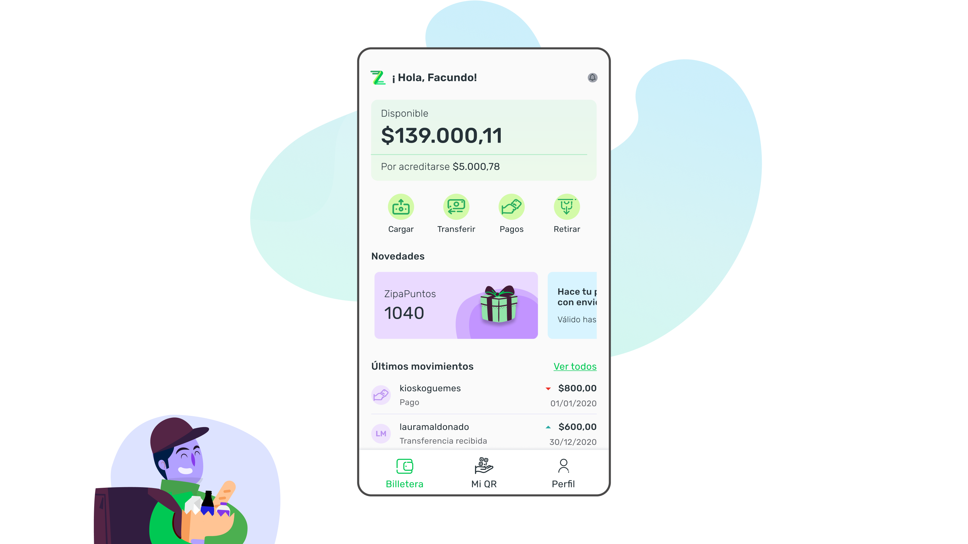
Home Screen: Surfaced the most frequent actions per role. Built for scalability, new actions or country specific features can be added without restructuring.

QR Payments: Sellers generate QR, buyers scan and confirm, fully within the app, no external redirect.
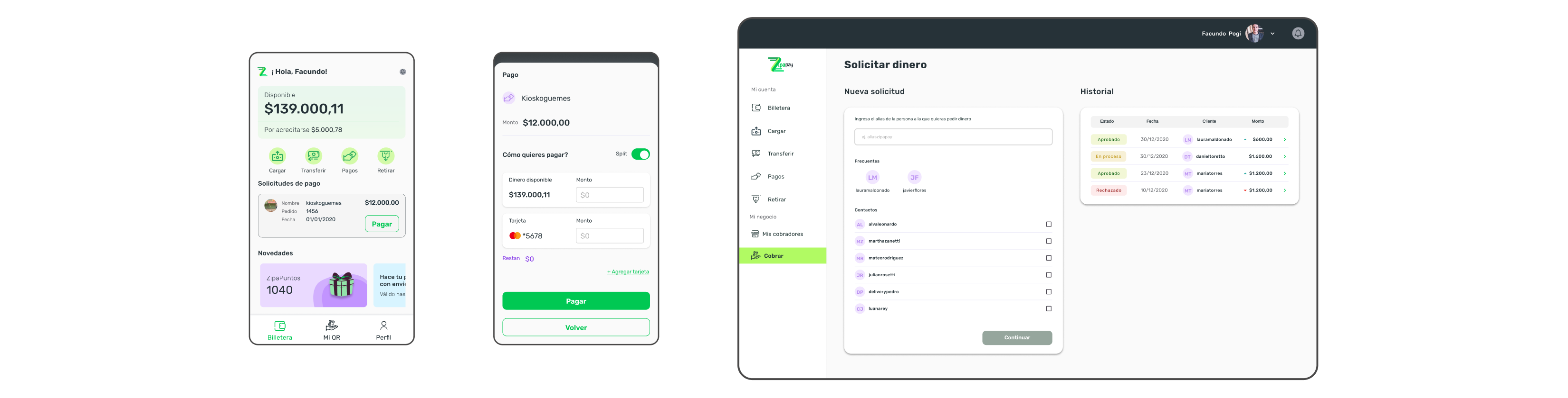
Push Based Payment Requests: A ZipaGo purchase triggers an automatic payment request in ZipaPay, buyer selects payment method without manually entering seller details.
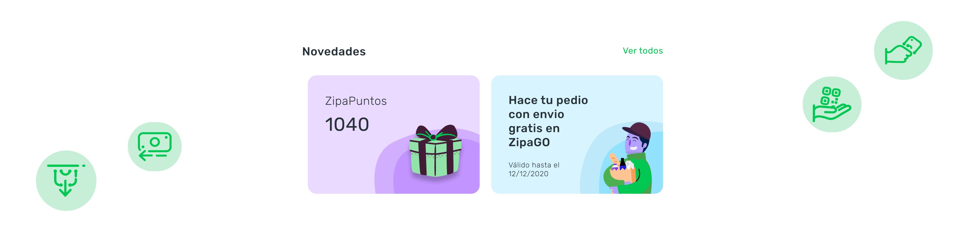
Rewards Section: Home screen included a dedicated area for loyalty benefits, designed to increase session frequency.

Back Office: Admin tools for payment management, role assignment, and transaction oversight. RBAC enforced at the UI level.
What changed
8+
Countries validated
- Positive stakeholder feedback on the payment flow integration, the Zipa team confirmed the experience was significantly smoother than the previous third party solution.
- Reduced support burden: in app payment completion eliminated the primary category of payment related support tickets.
- QR payment feature was ready for the contactless demand wave created by COVID-19
- Design served as the foundation for planned international market expansion, with scalable KYC and RBAC patterns.
What we consciously left out
In person user testing was not possible during the pandemic, the team relied on remote feedback and post-launch surveys to iterate.
International compliance research (per country banking regulations) was scoped as post-launch work, not pre-launch, accepted as a calculated risk given the MVP timeline.
Not all payment features were included in V1. Card linking and bank account association were deprioritized to ship QR payments on time.
How we worked together
Worked with the technical architecture team to validate that all design flows were feasible within the defined infrastructure before finalizing wireframes.
MVP scope was negotiated collaboratively with Product, the output was a shared priority list, not a designer imposed spec.
Presented findings directly to executive stakeholders to inform product investment decisions
Key Takeaway
“n fintech, distrust is a design problem. Every screen — especially onboarding — must actively communicate security and reliability. If users don't trust the app in the first 60 seconds, no feature set will recover that.”
Next case study
SaaS Client · B2B
Transforming Data into Insights for Financial Advisors
© 2026 marirumo