SaaS Client · B2B
Transforming Data into Insights for Financial Advisors
Designing an Advisor-Client Insights Dashboard | Fintech / Wealthtech | NaviPro | Figma + Design System.
Role
Product Designer (Scrum Team)
Timeline
Discovery through MVP, off budget initiative within active Scrum delivery
Team
Dedicated Scrum Team
Product
New data dashboard section added to an existing live product.
What needed to be solved
NaviPro lacked a dedicated section for advisors to monitor the health and performance of their client relationships. The product needed a new dashboard section that could surface insights clearly, within the existing tile based layout system, without user research access, and while reusing the existing design system.
- Give financial advisors a comprehensive, at a glance view of their client engagement and campaign performance.
- Surface actionable insights that encourage advisors to improve their engagement health score
- Enable campaign analysis without requiring advisors to leave the NaviPro platform.
What we set out to achieve
Business Goals
- Reduce the time from data observation to business decision
- Create a consistent visual language across all chart types
- Enable non-technical users to interpret complex data independently
Constraints
- No user testing or iterative feedback rounds, off budget initiative; all user assumptions derived from internal stakeholder input and public research
- Strict adherence to an existing design system 80%+ of components were reused or repurposed, not created from scratch.
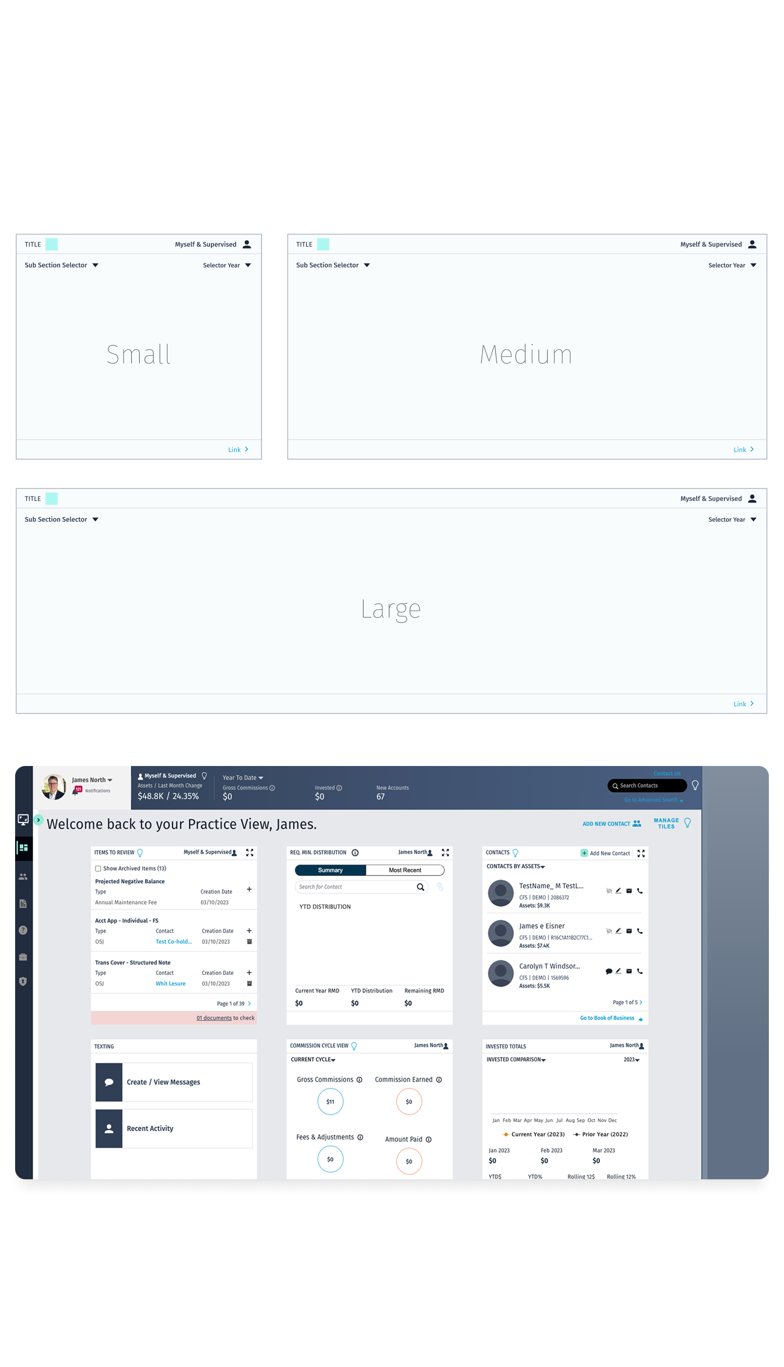
- Predefined tile system with fixed sizes and scroll behavior desktop only implementation
- Heavy reliance on data tiles for interaction and visualization, progressive disclosure via modals and selectors within tiles.
What we learned
Target users (financial advisors) prioritized rapid comprehension over feature discovery.
Implication
UI design should emphasize high information density with strong visual hierarchy and scannability, enabling near-instant insight extraction.
Tile based layout imposed constraints on content prioritization.
Implication
Primary views should surface only the most critical metrics, with secondary data accessible through progressive disclosure patterns to maintain clarity without sacrificing depth.
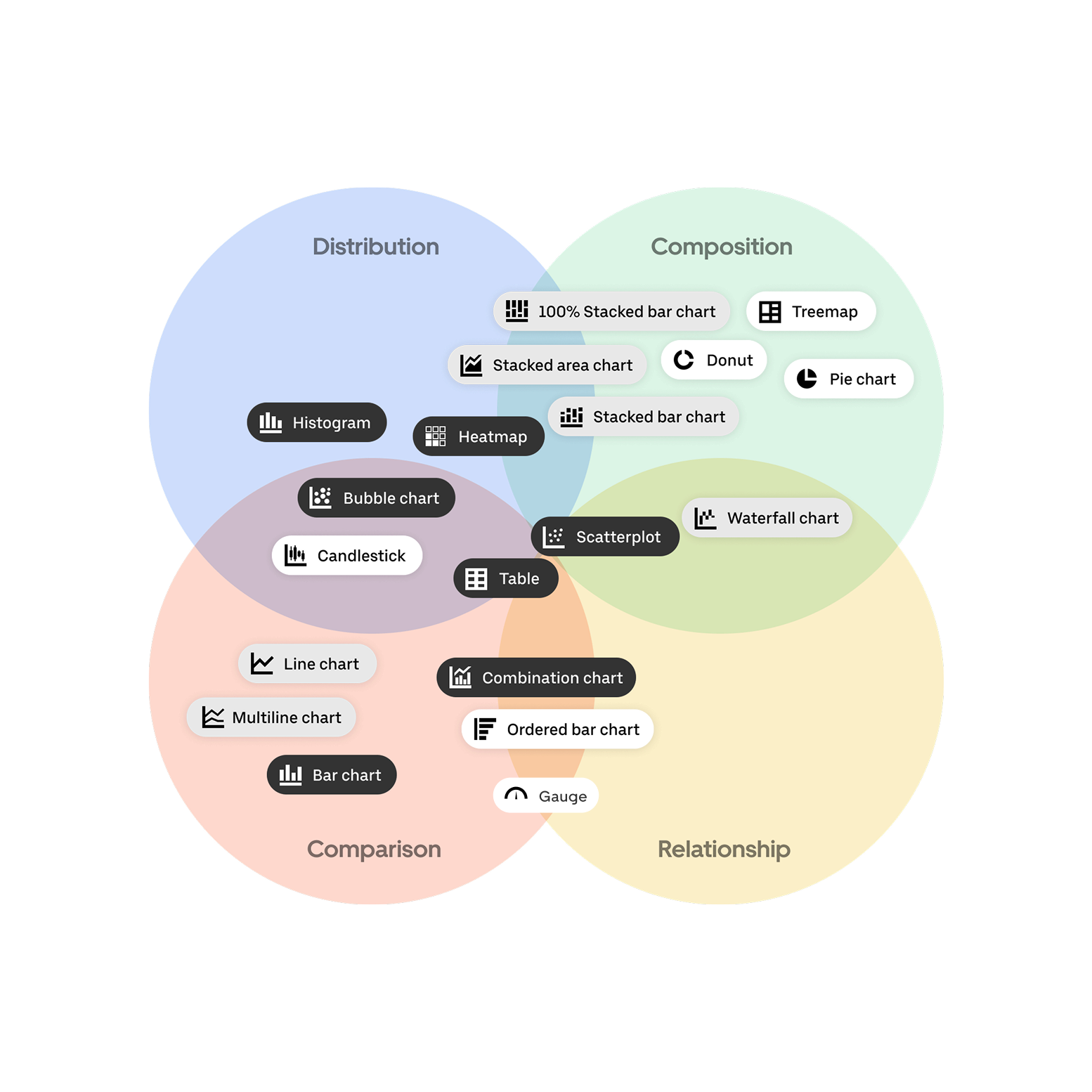
Effectiveness of data visualization depended on correct mapping between data type and chart type.
Implication
A strict data visualization framework must be defined within the design system to enforce correct usage of chart types and prevent misinterpretation of financial data.
Empty states lacked guidance and created ambiguity.
Implication
Empty states must be designed as active system states, incorporating instructional messaging and clear CTAs to guide users toward data population or clarify absence conditions.
The choices that shaped the work
Decision
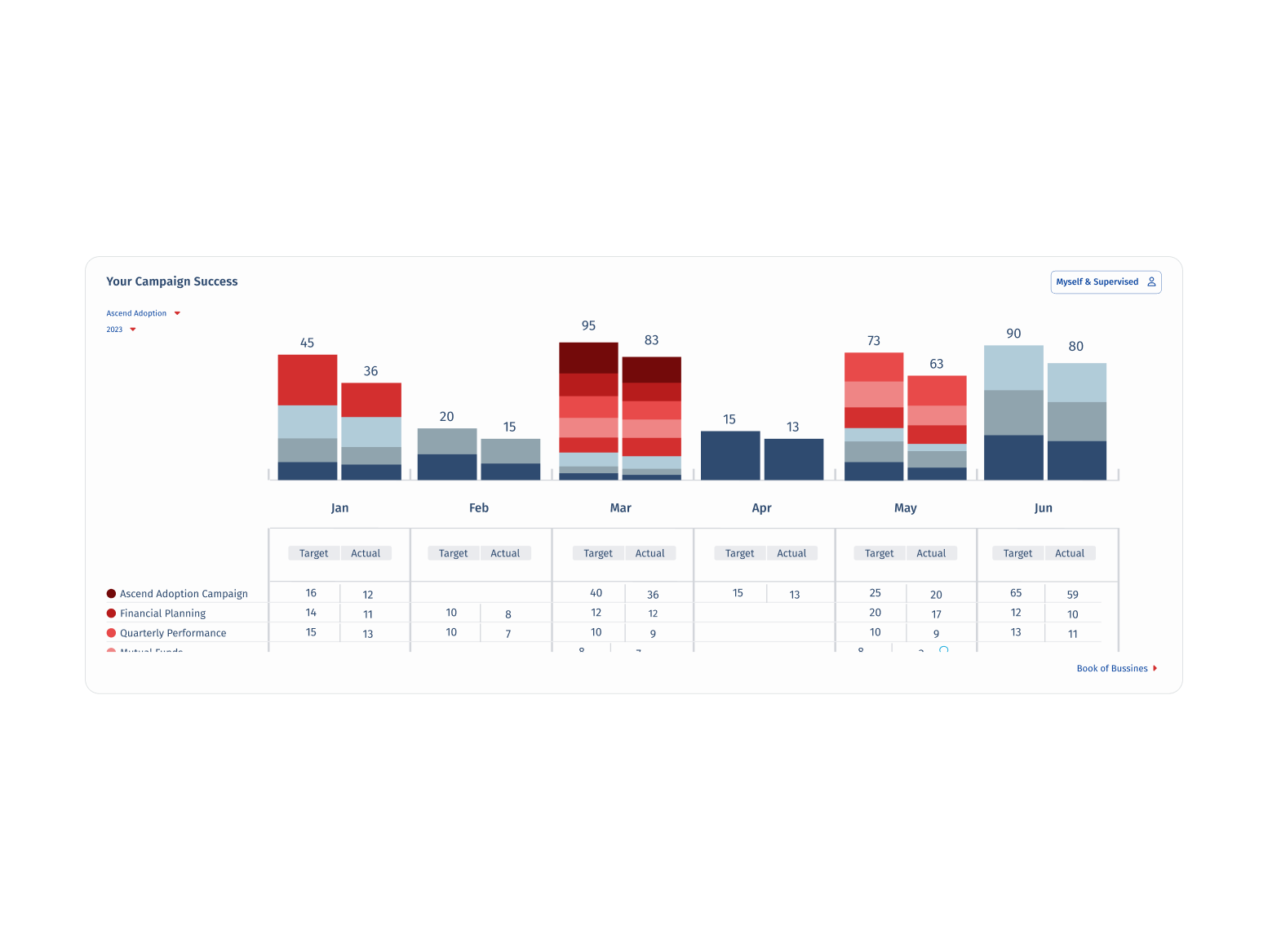
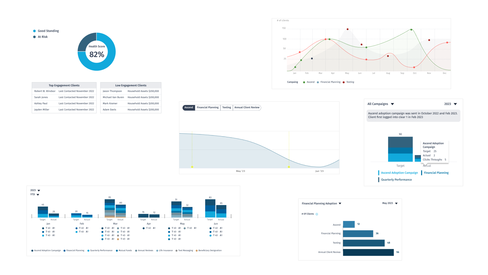
Match visualization type to data category (line graph, gauge, bar, table, stacked bar, donut)
Alternative considered
Use a single generic chart style for all metrics
Why we chose it
Each data type communicates differently. A gauge conveys a single score with qualitative ranges; a stacked bar shows composition over time. Generic charts would reduce clarity and decision-making speed.
Decision
Progressive disclosure via in-tile modals and selectors for secondary data
Alternative considered
Surface all data at once in expanded tile views
Why we chose it
Fixed tile sizes made information density a real constraint. Modals and selectors allowed deep dives without breaking the layout system or overwhelming the default view.
Decision
Reuse 80%+ of existing design system components rather than designing new ones
Alternative considered
Build all new components from scratch for dashboard context
Why we chose it
Reusing components maintained visual consistency with the broader NaviPro platform, reduced dev effort, and kept the new section feeling native not bolted on.
Decision
Design intentionally empty states for all tiles
Alternative considered
Leave tiles blank until data is available
Why we chose it
New advisors would encounter the dashboard before any data existed. Empty states had to communicate expected value and guide users toward action, not create confusion or distrust.
What we built
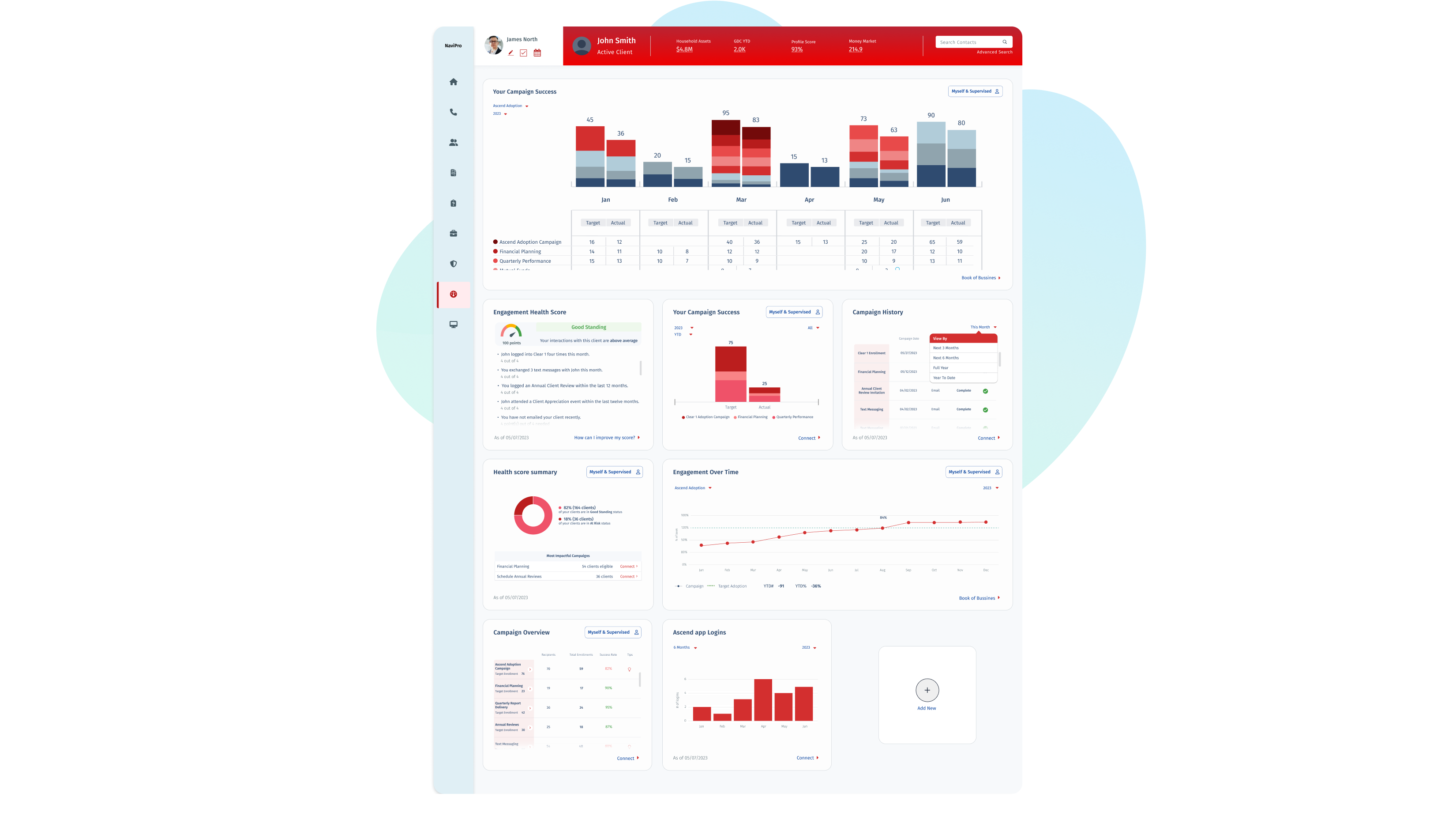
The dashboard was structured into three sections, each with a defined set of data tiles:
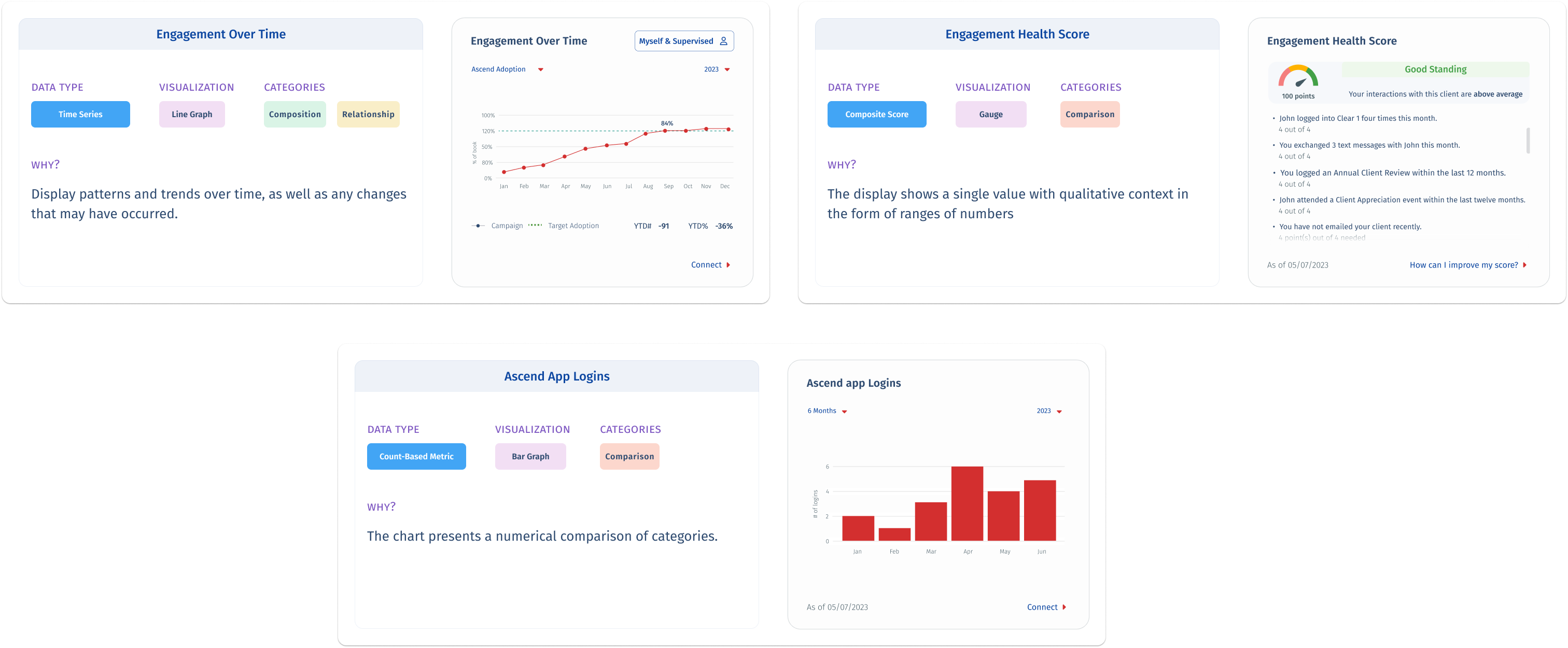
Engagement Section: Engagement Over Time (line graph), Engagement Health Score (gauge), Ascend App Logins (bar graph). Focused on how actively clients are engaging with the advisor's outreach over time.
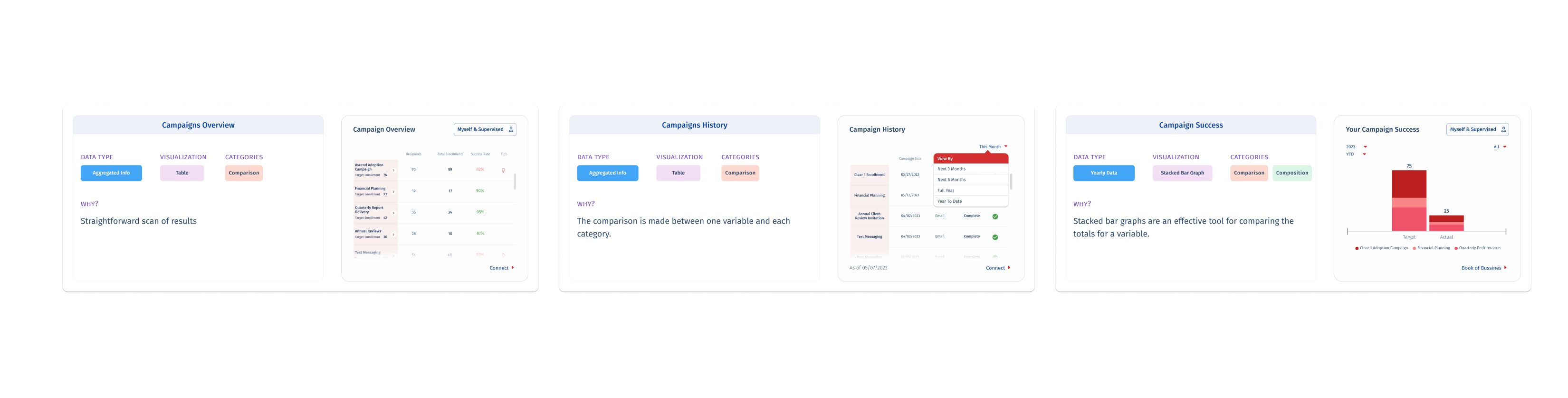
Campaigns Section: Campaigns Overview (table), Campaign History (table), Campaign Success (stacked bar graph). Enabled advisors to evaluate which campaigns drove results and how performance compared across years.

Health Score Summary: Most Impactful Campaign (donut chart). Highlighted the single highest-performing campaign to guide advisor attention and future planning..
What changed
Quantitative usage metrics were not available at the time of writing, the dashboard was in pre-launch at time of handoff. Stakeholder and product team feedback was consistently positive.
- Delivered a fully designed dashboard section, seven data tiles across three sections within the scope and budget constraints of an off roadmap initiative.
- 80%+ design system component reuse the new section integrated natively into NaviPro without introducing visual inconsistency or requiring new component builds.
- Positive stakeholder reception: the Finexa Group team validated that the visualization choices effectively surfaced the intended insights for the advisor persona.
- The data visualization framework — mapping chart type to analytical category — was adopted as a reference model for subsequent dashboard work within the team.
What we consciously left out
No user testing: all design decisions were grounded in stakeholder assumptions and secondary research rather than validated user behavior. This was accepted as a calculated constraint, not an oversight.
Fixed tile system limited layout flexibility: some metrics would have benefited from more screen real estate, but the predefined structure was a non negotiable platform constraint.
Desktop only scope: mobile access for advisors was identified as a future consideration but was explicitly out of scope for this phase
How we worked together
Worked directly with internal stakeholders at Finexa Group to define the key metrics and data requirements for each section — no direct user access meant stakeholder input was the primary research input.
Visualization choices were documented with analytical rationale (data type, category, chart type) and shared with the development team to align on rendering requirements before build.
Operated within the Scrum team structure, design decisions were reviewed in sprint ceremonies and validated against product owner priorities before finalizing tile content and interaction patterns.
Key Takeaway
“Designing for data is designing for decisions. The right chart type, placed in the right tile, at the right level of disclosure, is not a visual preference, it's a functional requirement. When constraints are fixed, the design work is in the prioritization, not the canvas.”
Next case study
Enterprise Client · Design System
Rebuilding a Design System from Audit to Governance
© 2026 marirumo